
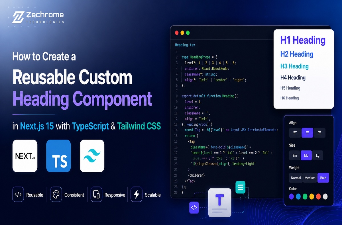

Modern web applications need consistency. Every page should have clean, accessible, and responsive headings without repeating the same code. That’s where a reusable heading component becomes incredibly useful.
If you’re building applications with Next.js 15, TypeScript, and Tailwind CSS, creating reusable UI components is one of the smartest ways to keep your codebase clean and scalable.
In this guide, you’ll learn how to build a flexible custom heading component that improves developer experience, maintains design consistency, and follows modern React best practices.
Why Create a Reusable Heading Component?
Many developers directly use <h1>, <h2>, and <h3> tags throughout their projects. While this works for small applications, larger projects quickly become difficult to maintain.
A reusable heading component helps you:
- Maintain a consistent design across every page
- Reduce repetitive code
- Improve readability
- Simplify future design updates
- Keep typography standardised
- Build scalable UI systems
As projects grow, reusable components become an essential part of modern frontend development.
Why Next.js 15?
Next.js 15 continues to improve performance and the overall developer experience.
Some notable advantages include:
- Faster rendering
- Better Server Components support
- Improved routing
- Enhanced TypeScript integration
- Optimised performance
- Modern React architecture
These improvements make Next.js 15 an excellent choice for building production-ready web applications.
Why TypeScript?
TypeScript helps catch errors during development instead of production.
Benefits include:
- Strong type safety
- Better autocomplete
- Improved developer productivity
- Easier refactoring
- More reliable codebase
When creating reusable components, TypeScript makes your API much easier to maintain.
Why Tailwind CSS?
Tailwind CSS has become one of the most popular styling solutions because it enables developers to build interfaces quickly without writing large CSS files.
Advantages include:
- Utility-first approach
- Responsive design made simple
- Faster development
- Easy customisation
- Smaller production CSS
Combined with reusable React components, Tailwind creates a clean and maintainable workflow.
Step 1: Create the Heading Component
Create a new component inside:
components/Heading.tsx
The component should:
- Accept different heading levels
- Support custom styling
- Allow additional class names
- Be reusable throughout the application
Using TypeScript interfaces ensures the component remains safe and predictable.
Step 2: Support Multiple Heading Levels
Instead of creating separate components for every heading size, allow the component to render different HTML heading tags dynamically.
This enables you to use:
- H1
- H2
- H3
- H4
- H5
- H6
while keeping a single reusable component.
This approach keeps your code cleaner and easier to maintain.
Step 3: Add Tailwind Typography
Apply Tailwind utility classes for typography, spacing, and responsiveness.
Typical styling includes:
- Responsive font sizes
- Bold typography
- Proper line height
- Consistent spacing
- Dark mode compatibility (if required)
Because all styling lives inside one component, updating typography across your application becomes much easier.
Step 4: Make It Flexible
A reusable component should adapt to different use cases.
Consider supporting:
- Custom CSS classes
- Text alignment
- Font weight
- Colour variations
- Margin control
- Responsive behaviour
The more flexible your component is, the fewer duplicate components you’ll need later.
Step 5: Use It Anywhere
Once your component is ready, you can use it across:
- Landing pages
- Blog posts
- Documentation
- Dashboards
- Product pages
- Portfolio websites
- Admin panels
Instead of repeating typography styles on every page, simply reuse the same component.
This saves time while keeping your interface visually consistent.
Best Practices
When building reusable heading components, keep these best practices in mind:
✅ Use semantic HTML headings in the correct order.
✅ Keep the component lightweight.
✅ Avoid unnecessary props.
✅ Use TypeScript for better maintainability.
✅ Follow accessibility guidelines.
✅ Keep Tailwind classes organised.
✅ Design for responsiveness.
Following these practices results in cleaner, more scalable applications.
Common Mistakes to Avoid
Even experienced developers sometimes make these mistakes:
- Skipping heading hierarchy
- Hardcoding font sizes repeatedly
- Ignoring accessibility
- Creating multiple similar components
- Overcomplicating the component API
- Mixing presentation with business logic
Keeping your component simple makes it easier to maintain as your project grows.
SEO Benefits
A well-structured heading system also improves SEO.
Search engines rely on heading hierarchy to better understand page structure.
Using semantic headings helps:
- Improve content organisation
- Enhance readability
- Support accessibility
- Strengthen on-page SEO
- Improve user experience
Although headings alone won’t determine rankings, they contribute to a well-optimised page structure.
Performance Benefits
Reusable components also contribute to better project maintenance.
Benefits include:
- Less duplicated code
- Easier updates
- Better team collaboration
- Faster development
- Improved code readability
- More consistent UI
As applications scale, these small improvements make a significant difference.
Final Thoughts
Building a reusable custom heading component in Next.js 15 with TypeScript and Tailwind CSS is a simple improvement that delivers long-term value.
Instead of repeating typography styles across your application, you create one flexible component that promotes consistency, scalability, and cleaner code.
Whether you’re developing a personal portfolio, a SaaS platform, a business website, or a large enterprise application, reusable UI components are a fundamental part of modern frontend development. Starting with a well-designed heading component is an excellent step towards building a maintainable and professional codebase.
